
Minimal utility app
It’s a clock. That’s the point.
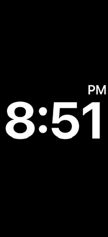
A stripped-down clock app with a plainspoken name and a visual identity that stays black, white, and direct.
Minimal design
High contrast
Simple utility
Design approach
Clean, blunt, and intentionally minimal.
This page keeps the same spirit as the app itself: no extra noise, no fake complexity, and no attempt to turn a straightforward utility into something it isn’t.
- Bold time-first interface
- Simple black-and-white presentation
- Useful for users who want immediacy over extras
- A clear contrast to the more expressive Xæra products
Questions, support, or beta feedback?
Ready to get It’s a clock?